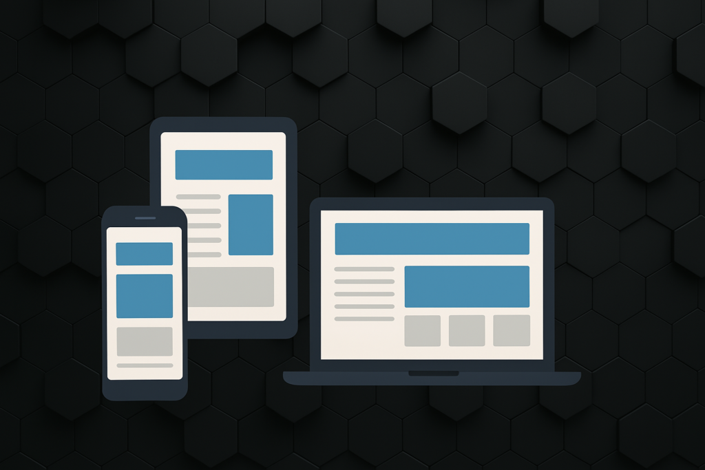
The Key to User Experience Across Devices
In today’s digital-first world, your website isn’t just your business card — it’s your storefront, your pitch, your lead magnet, and your customer service hub all rolled into one.
But here’s the catch: people aren’t only visiting your site from laptops or desktops anymore. They’re browsing from smartphones during their commute, tablets while watching TV, or even smart fridges (yes, that’s a thing now).
So if your website doesn’t adapt seamlessly to any screen size, you’re instantly leaving users frustrated—and probably losing sales.
Let’s talk about why responsive web design is non-negotiable and the game-changing benefits it brings to your business.
What Is Responsive Web Design?
Responsive web design (RWD) means your website dynamically adjusts its layout, content, and elements to fit the screen it’s being viewed on — whether that’s a mobile phone, tablet, laptop, or massive 4K monitor.
Think of it like this: it’s not about building a site for every screen size out there. It’s about building a flexible experience that works beautifully on all of them.
Why It Matters More Than Ever
📱 Mobile-First World
Over 60% of all web traffic now comes from mobile devices. If your site isn’t optimised for mobile users, you’re turning away more than half your potential audience.
⏳ First Impressions Count
It takes just 0.05 seconds for users to form an opinion about your site. A clunky, non-responsive layout screams “outdated” and erodes trust.
🧠 UX = Brand Perception
A seamless experience = happy users. A frustrating one? They’ll bounce — and they may never come back. Responsive design ensures fast load times, readable text, intuitive navigation, and smooth interaction regardless of the device.
The Top Benefits of Responsive Web Design
✅ 1. Better User Experience (UX)
UX is everything. A responsive design ensures your users can:
-
Read content without zooming or squinting
-
Navigate menus easily with their thumb
-
Interact with buttons that aren’t tiny or misaligned
This creates a frictionless experience that encourages users to stay longer and engage more.
✅ 2. Improved SEO Performance
Google LOVES responsive websites.
In fact, Google moved to mobile-first indexing, meaning it primarily uses the mobile version of your site for ranking and indexing.
Responsive sites tend to:
-
Rank higher in search results
-
Load faster (a key ranking factor)
-
Have lower bounce rates
Translation? More visibility + better traffic.
✅ 3. Easier Maintenance and Lower Costs
Maintaining one responsive website is much easier than juggling multiple versions for different devices. That means:
-
Less time spent on updates
-
Fewer headaches with content duplication
-
Lower development and maintenance costs in the long run
✅ 4. Future-Proofing Your Website
New screen sizes, devices, and browsers are constantly emerging. A responsive design ensures your site can adapt gracefully, no matter what’s next.
✅ 5. Increased Conversion Rates
Responsive websites create smoother sales funnels. Whether someone’s filling out a contact form or buying a product, they’ll do it faster and more confidently if everything works perfectly on their device.
And yes, even small improvements in UX can lead to big gains in conversions.
Want a Website That Works Everywhere?
At MOVΛND, we design and build responsive websites that don’t just look great — they perform. Whether you’re selling online, showcasing your portfolio, or building your brand, we’ll ensure your site provides a seamless, intuitive experience on every device.
Let’s build something brilliant — get in touch with us today.